VERY FEW MEDIUMS CAN REPRESENT A BRAND GREATER THAN PACKAGING.
SONOMA VINEGAR
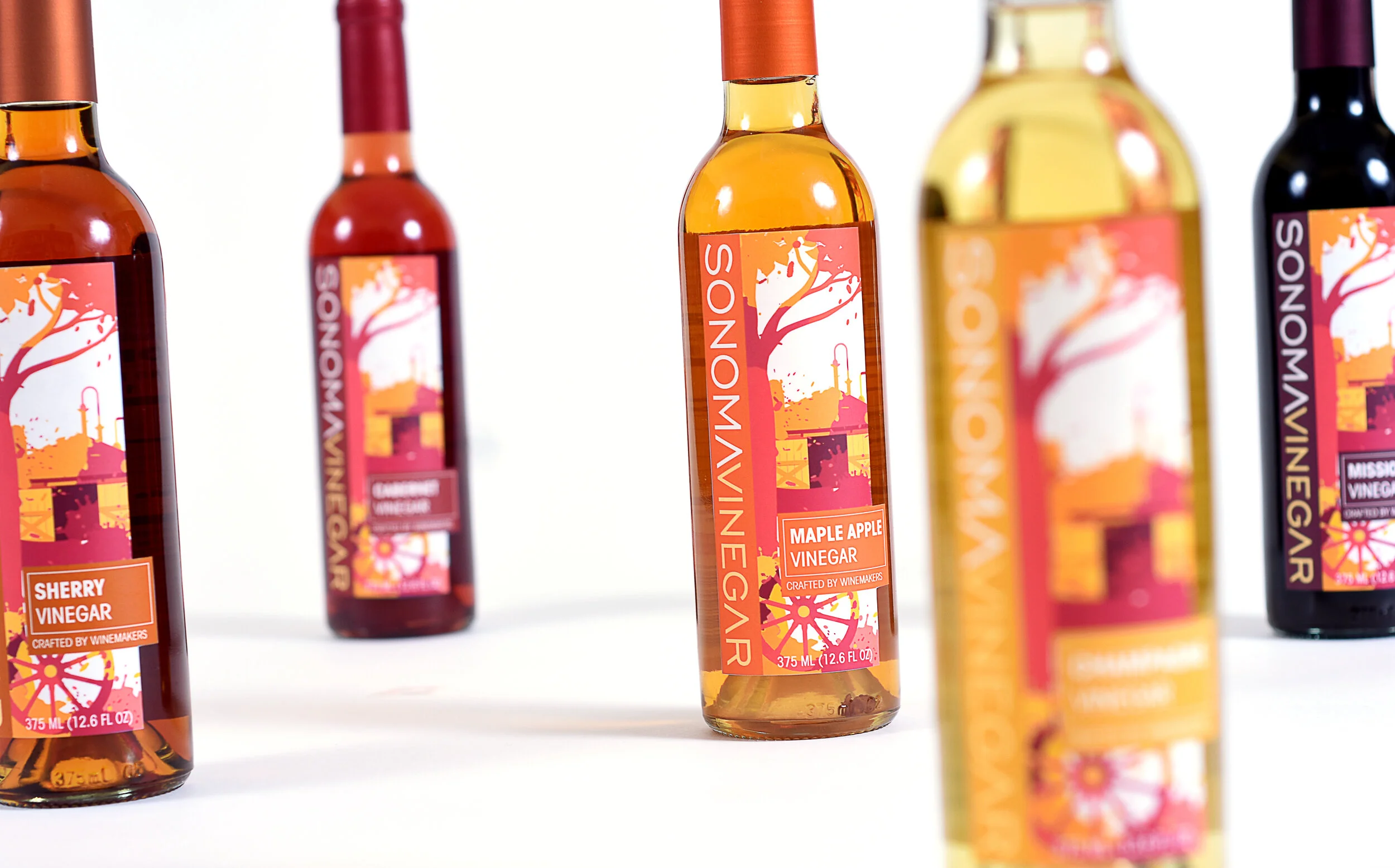
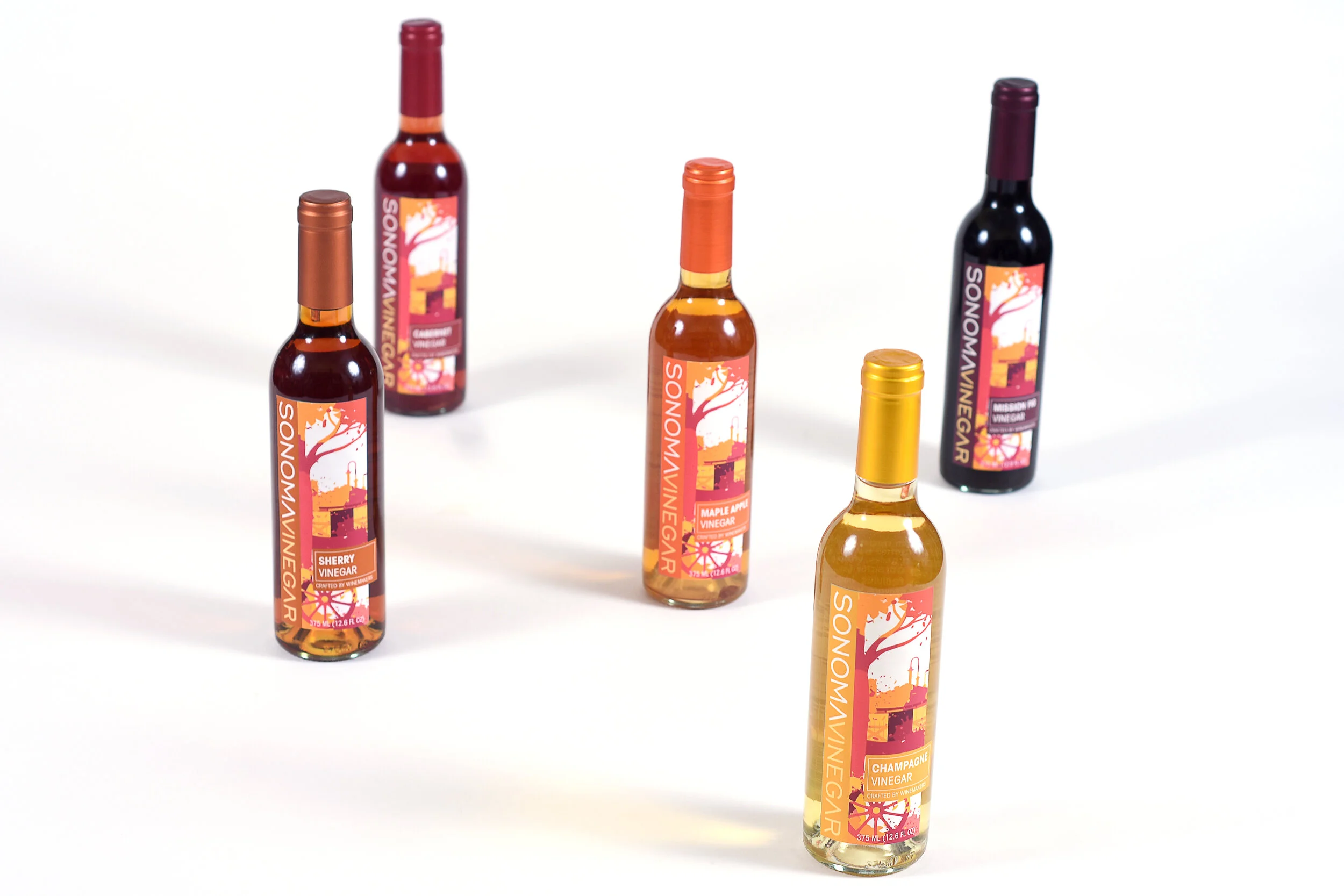
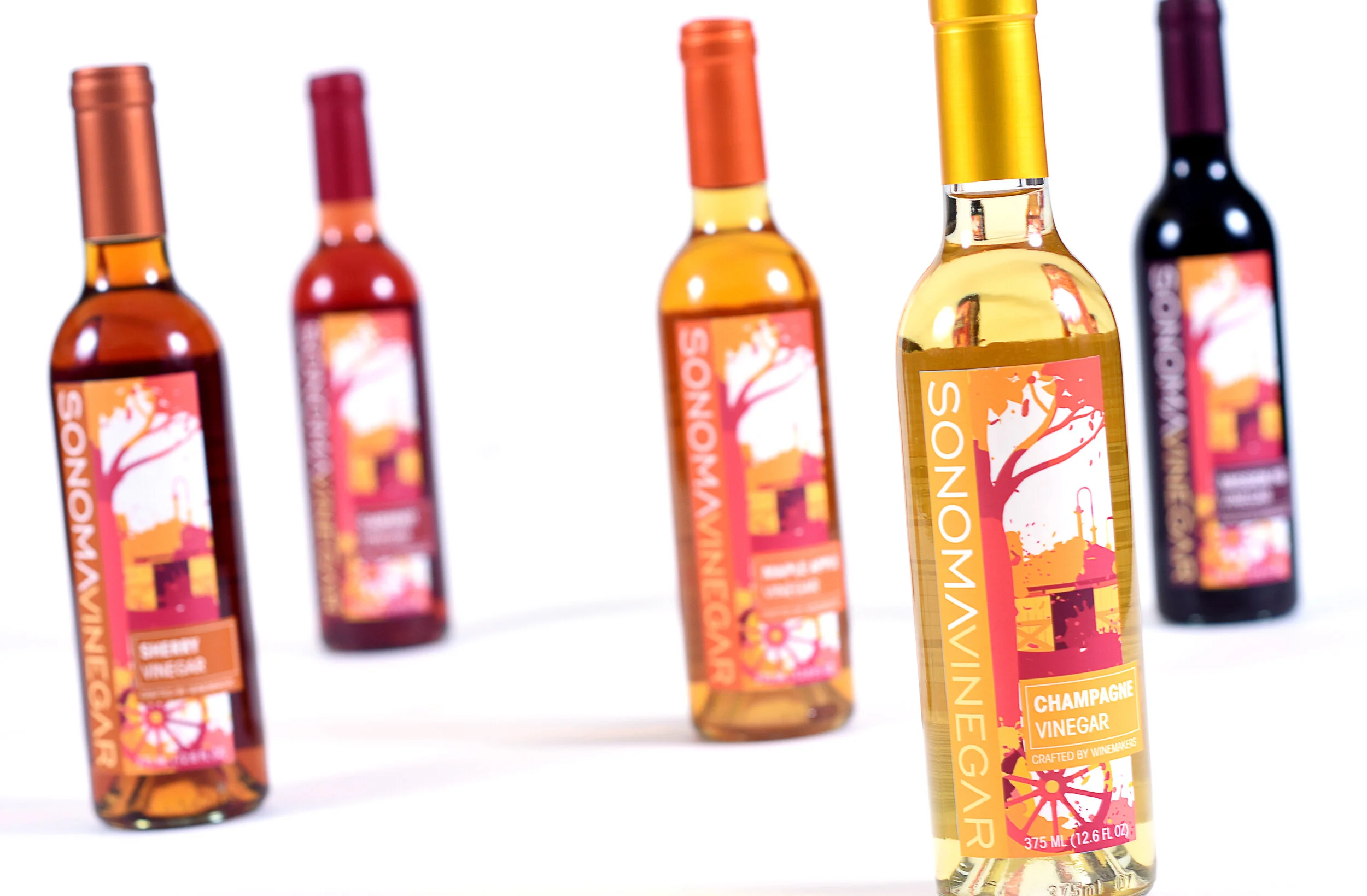
Sonoma Vinegar™ was one of my all-time favorite projects to work on. The clients were excited, quirky and ready to give me nearly full creative control. My role in this project was lead/sole designer. The client was ambitious in the amount of concepts they wanted and were willing to use the time and resources to find the perfect iteration. I ended up with twenty initial concepts, dwindled that down to one favorite that was then run through about three rounds of revisions. Next I moved on to matching the colors of each label to each varietal and foil. This was a daunting yet rewarding project.
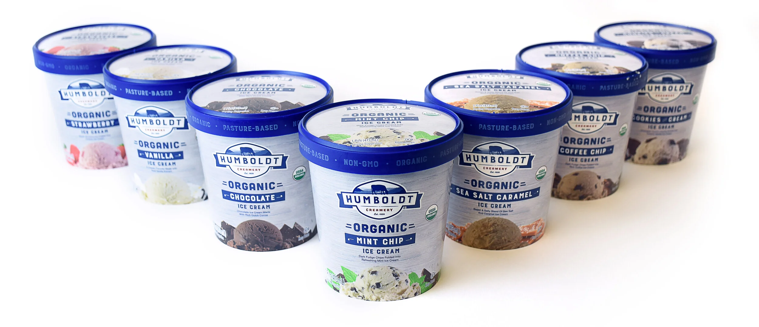
HUMBOLDT CREAMERY
Humboldt Creamery® has been in operation since 1921. Nearly 100 years later, I was lucky enough to be a part of their ice cream packaging redesign. I started with several concepts that all fell within the strict guidelines of the creative brief. Once a concept was chosen I extended the design to the rest of the flavors, which included taking photos of scoops of ice cream in an industrial freezer so they wouldn’t melt. From there I created mockups working with a local printer. In the end we ended up with a strong and timeless package design.
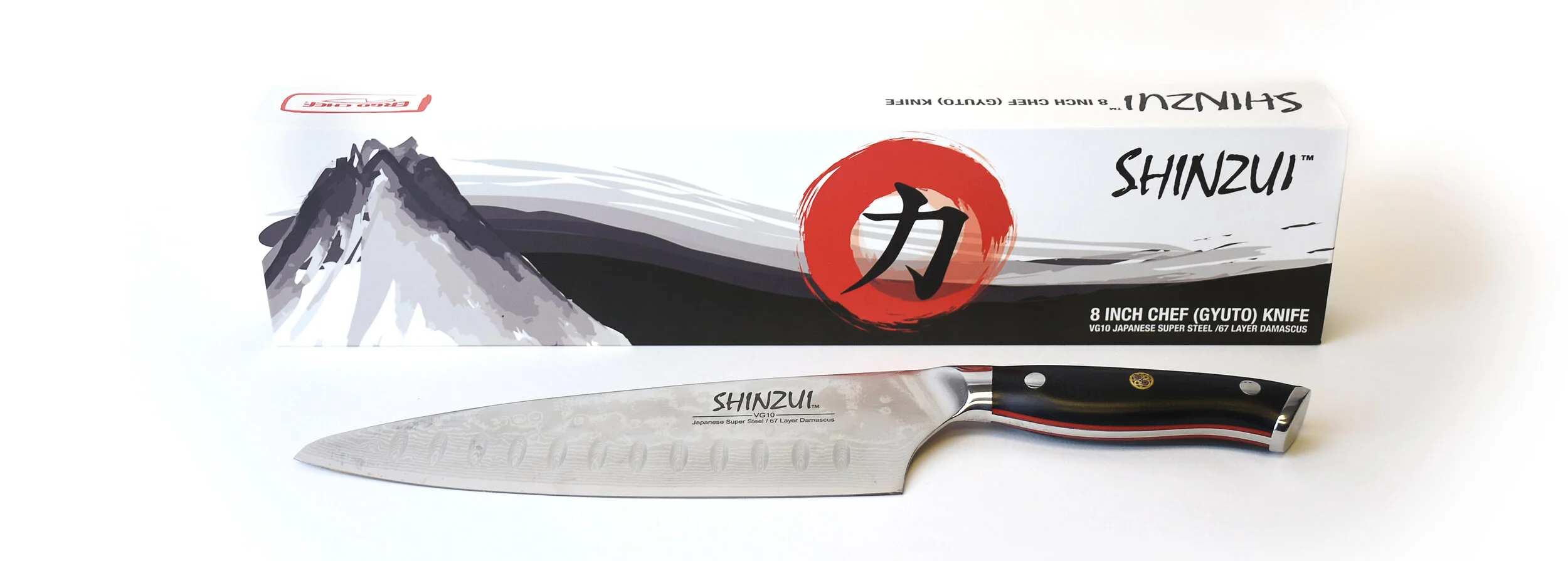
ERGO CHEF
Ergo Chef® crafted a beautiful, 8 inch, Japanese Damascus steel, gyuto knife. They wanted packaging that represented the rich history of Japan and the beautiful art of that region. This was a great project to spread my illustration wings on and really capture that painterly, large brush strokes aesthetic. I’ve always loved the black and white with a specific pop of red to draw the eye. These are traditional techniques that are still used in modern design, wether in a website CTA or a callout bug on a package.
YANK SING
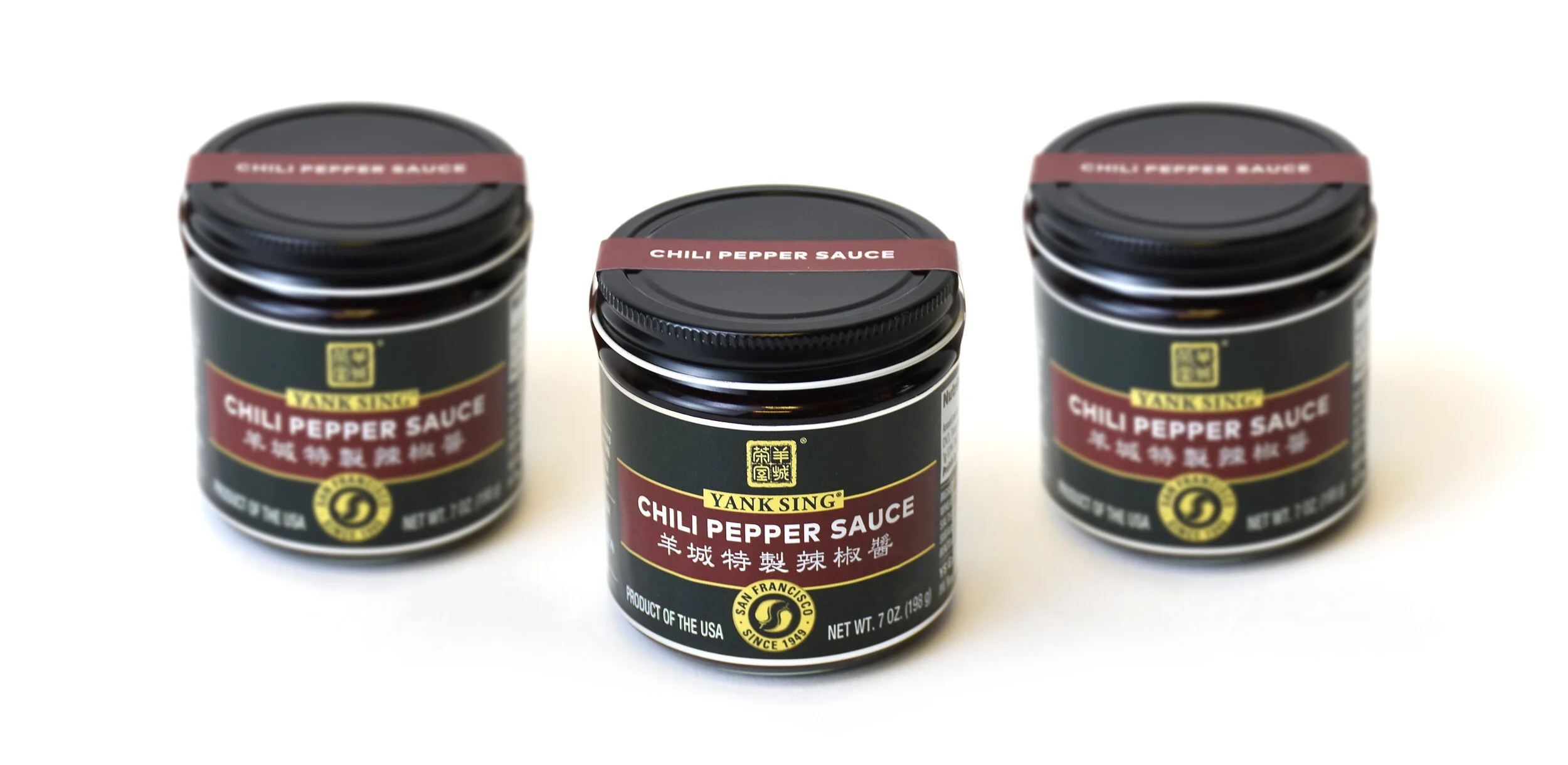
Yank Sing® is a contemporary and traditional dim sum restaurant in San Francisco that has been highly regarded since the late 1950’s. Their chili pepper sauce was loved by customers they decided to bottle it and sell it. They wanted to keep the traditional feel of the restaurant in the packaging but give it a modern touch. The strip over the top of the cap helped achieve a tamper proof seal but also gave it a high-end feel. Once I succeeded in the packaging process they wanted to turn the “pepper bug” near the bottom of the label into merchandise, including hats and shirts.
