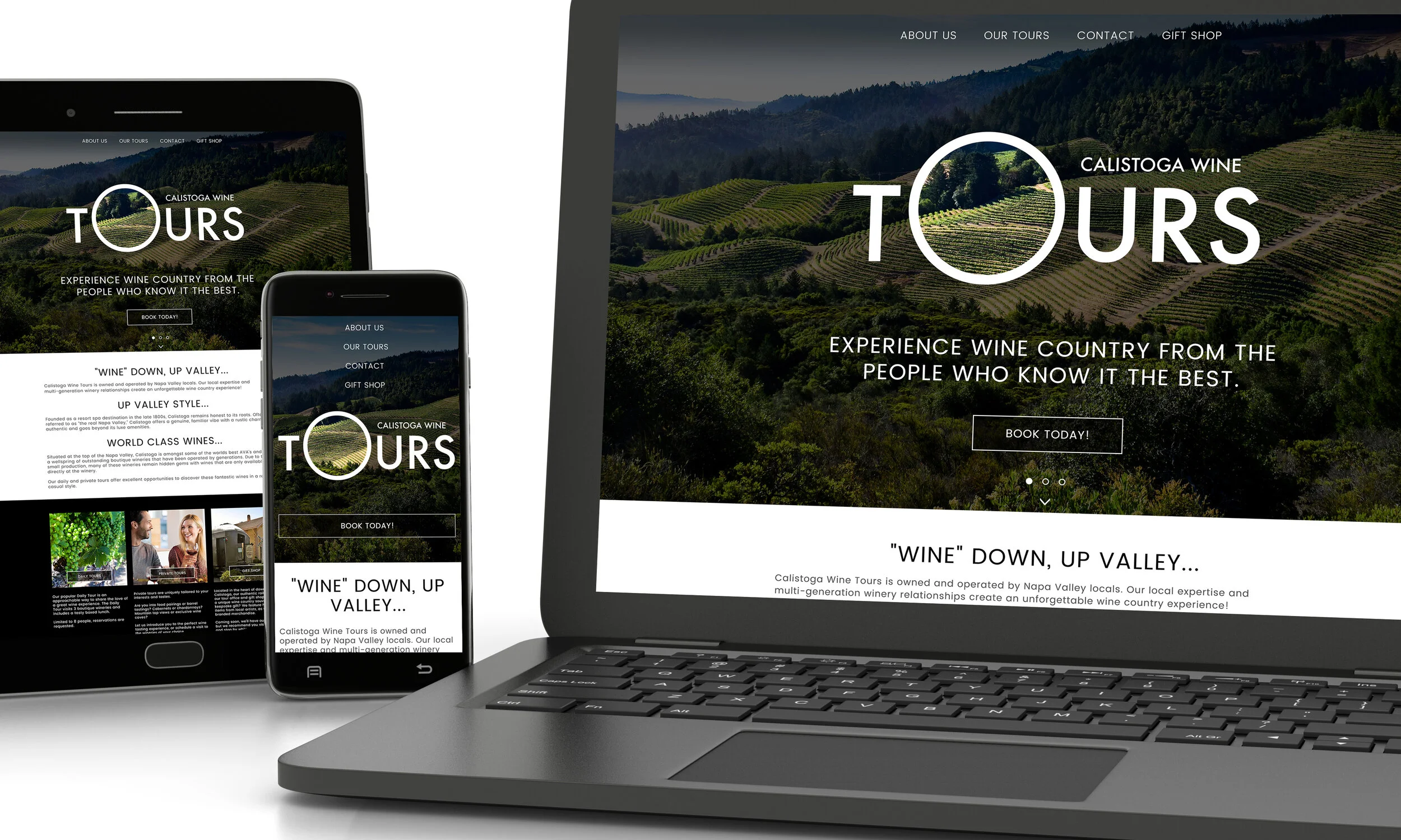
HAVING A WEBSITE IS CRUCIAL FOR ANY BUSINESS BUT IF IT’S NOT RESPONSIVE ACROSS ALL DEVICES AND PLATFORMS, YOU’RE DEAD IN THE WATER.
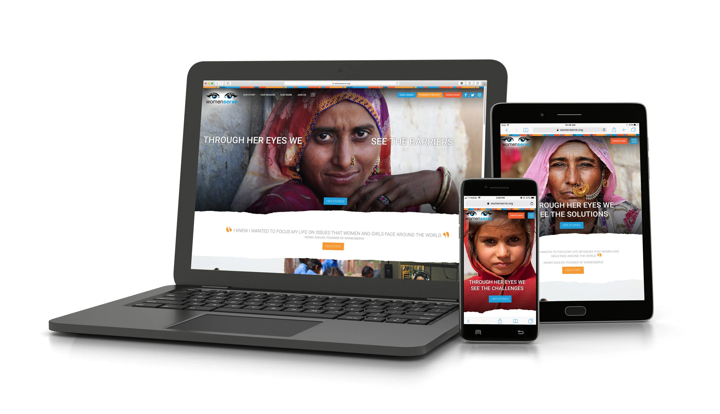
WOMENSERVE
WomenServe™ is an incredible organization with an incredible cause. I’m very proud and honored to be a part of it. I was in charge of every visual aspect of this website, from conception to completion. I used Adobe XD to mock up concepts and dictated to developers how animations should be featured. I worked directly with the client, including presenting my concepts to the owner and other stakeholders to bring their vision to life. In the end, everyone was proud and happy with the process and the final product.
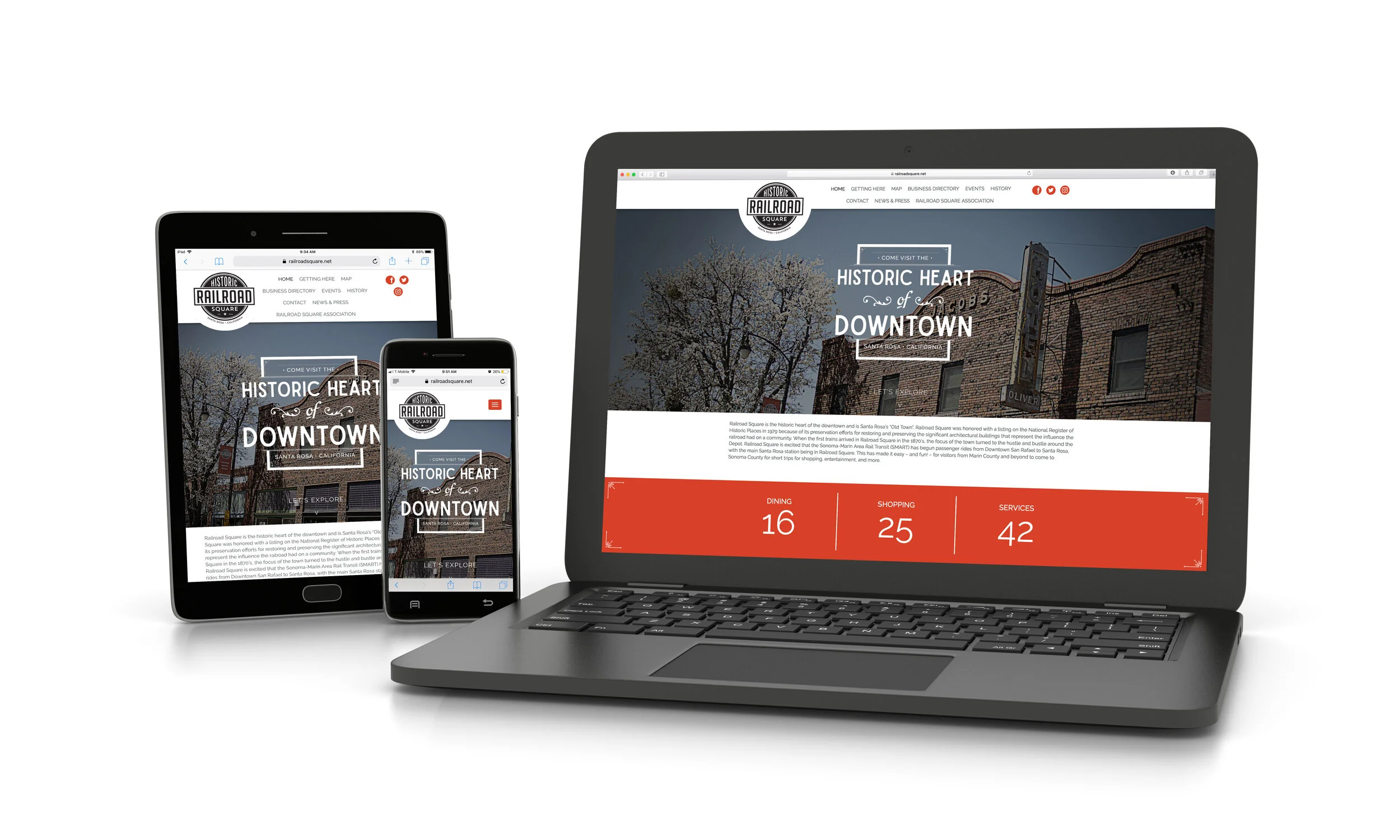
HISTORIC RAILROAD SQUARE
This was a rewarding project. The beautiful architecture and rich history of this city was a powerful muse. I took lead on this project and worked with the client to make sure we captured the feel of downtown Santa Rosa in all it’s glory. The most challenging part was creating an interactive map of the area that users could use to learn more about all the shops and landmarks in the area.
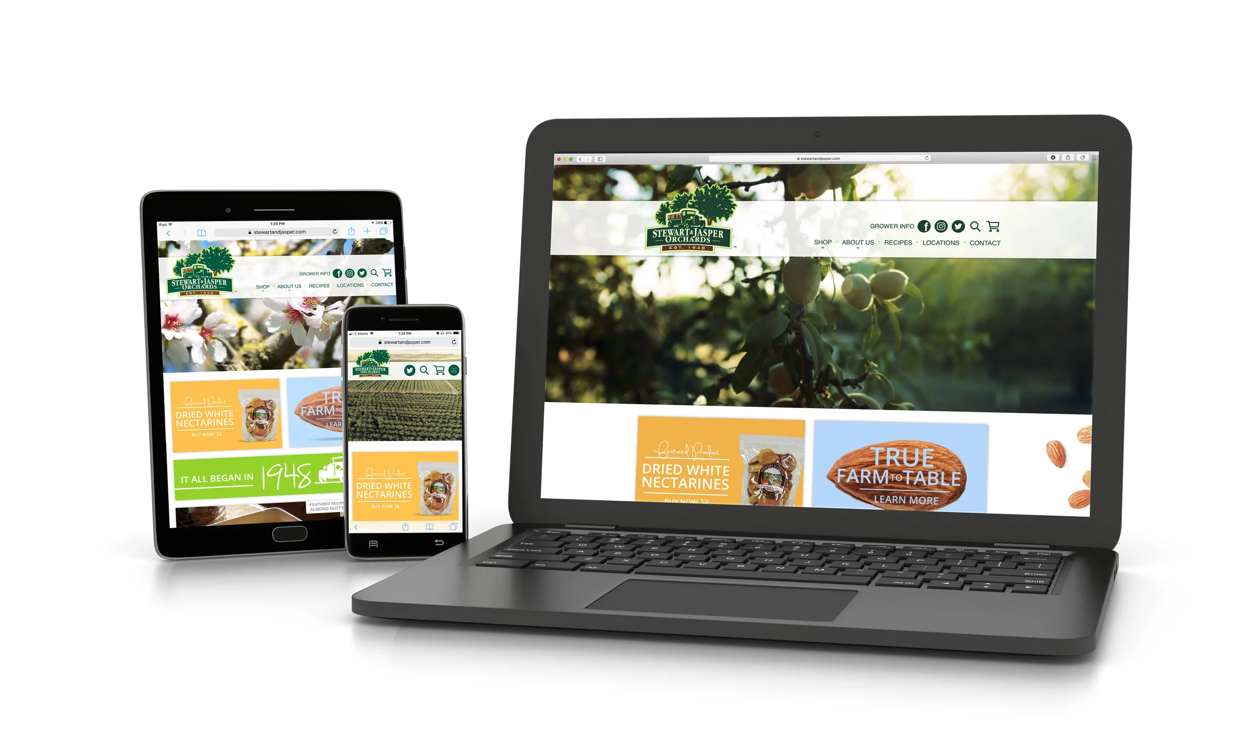
STEWART & JASPER
This amazing company has been around for 70+ years and with that came a lot of outdated branding and visuals. Although they weren't willing to budge on their logo they were receptive to updating everything else. I started from the ground up and injected modern branding along with an updated and responsive website. This was a large undertaking that went for review in front of countless people which is always challenging but we all ended up with a final product that we loved.
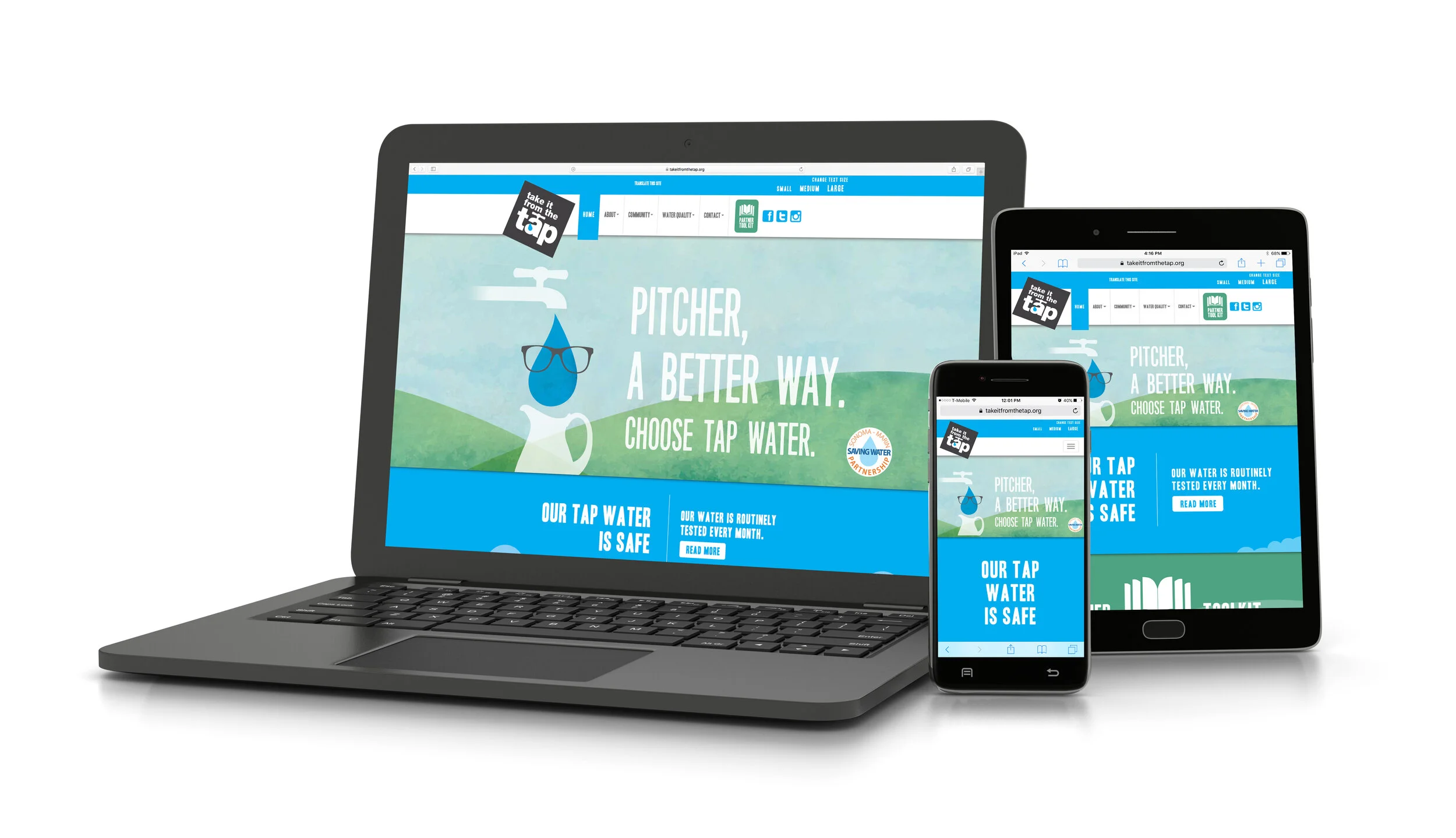
CITY OF SANTA ROSA
The Take it From the Tap campaign was an effort put forth by the City of Santa Rosa. This was done to urge residents to drink more tap water, reducing the amount of plastics being put into landfills. Working with a government entity can be challenging considering your designs have to go through countless levels of approval and scrutiny. I was not deterred by this though and moved forward with a fun new mascot and a strong cohesive brand. I even created an animated commercial to drive people to the site.
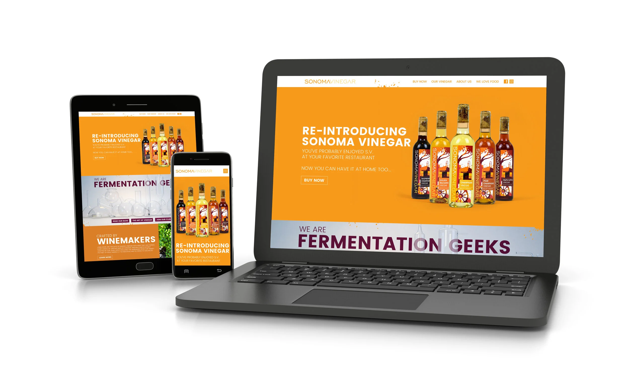
SONOMA VINEGAR
This is one of my favorites websites I’ve ever designed. I already had the pleasure of creating their branding and packaging so when it came to the website, the roll out felt natural. They gave me full creative license which resulted in some bright colors, strong CTA’s and a lot of moving elements.
